 Quick Search is essential to your daily tasks in Flexmls, so on April 18th, we’re refining the user experience to give you more room to work in Flexmls Web.
When Will It Change
These updates will be available on April 18, 2019.
Who Will Be Affected
All users who have access to the Quick Search function in Flexmls Web will see these changes.
What Will Change
Better Use of Space
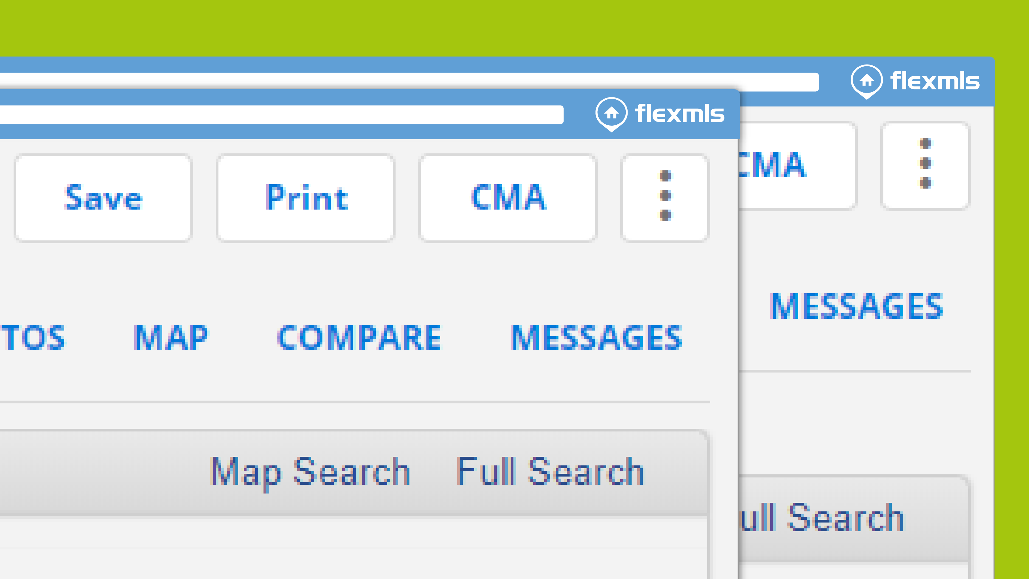
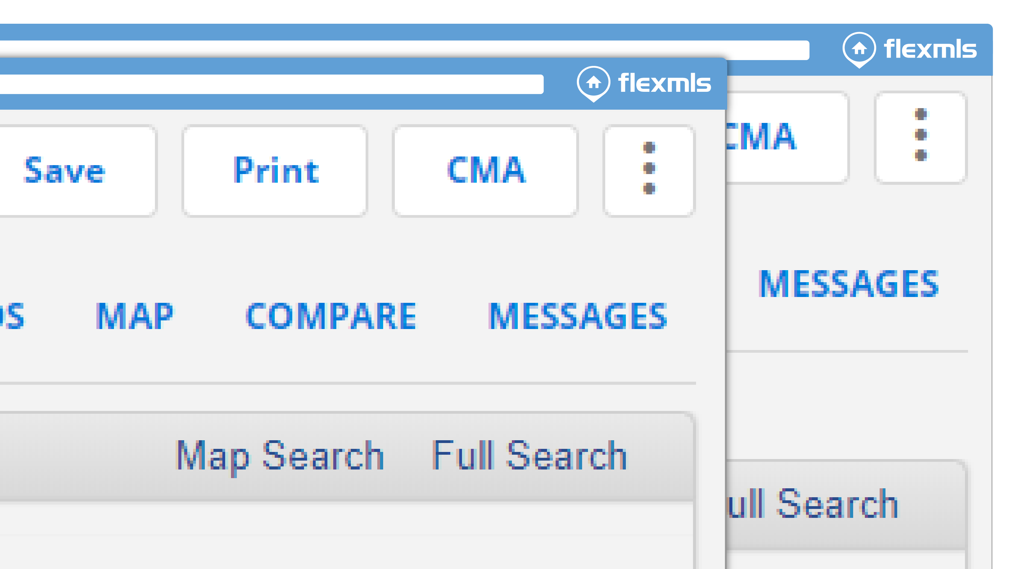
We’re minimizing the amount of empty space on the page when using a Quick Search in Flexmls Web. On the search results page for a Quick Search, the space between the tabs and listing information is being reduced, allowing more room on the page to display search results.
Some Options Will Move
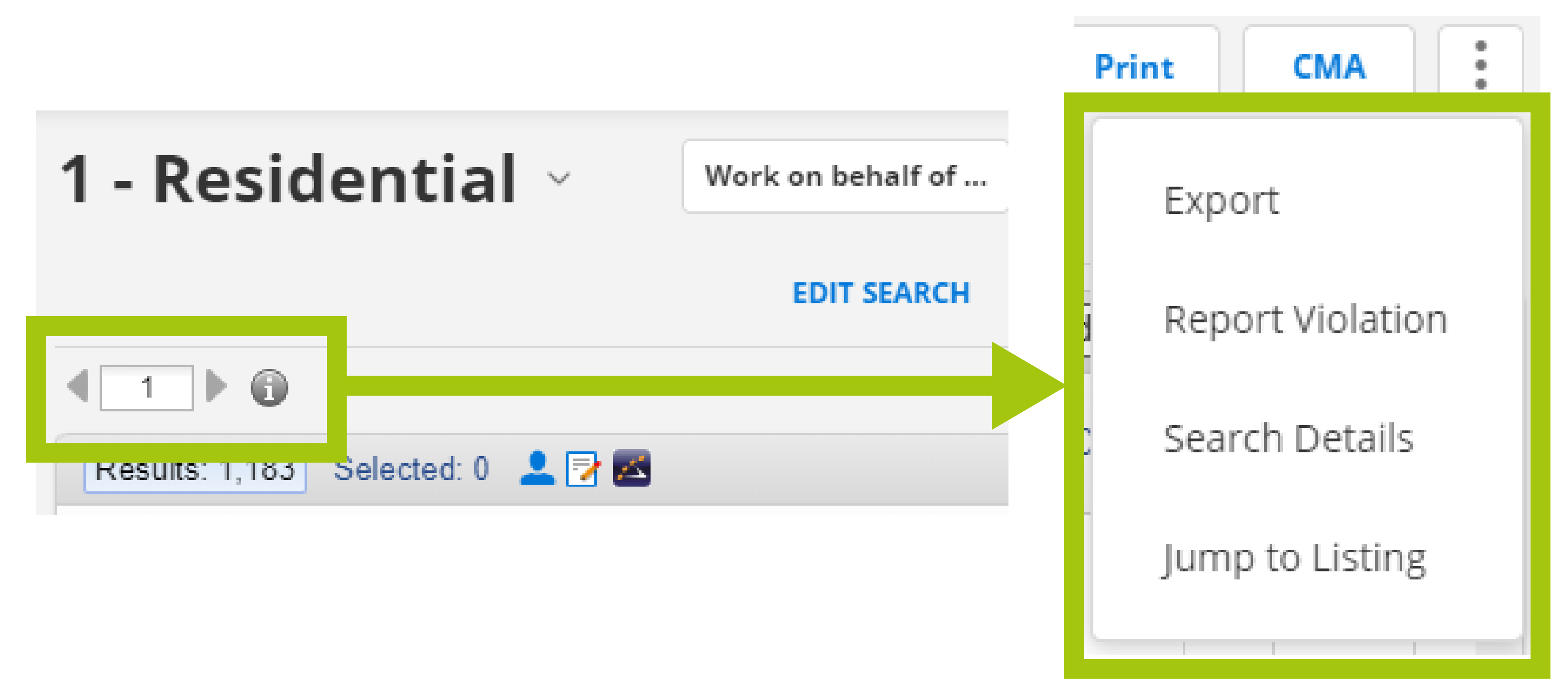
On the List, Detail, Photos, Map, Compare, and Messages tabs, decreasing this space means that the options currently displayed in this area will be relocated. The Search Details option and the Jump to Listing selector will be available from the More (three vertical dots) menu instead.
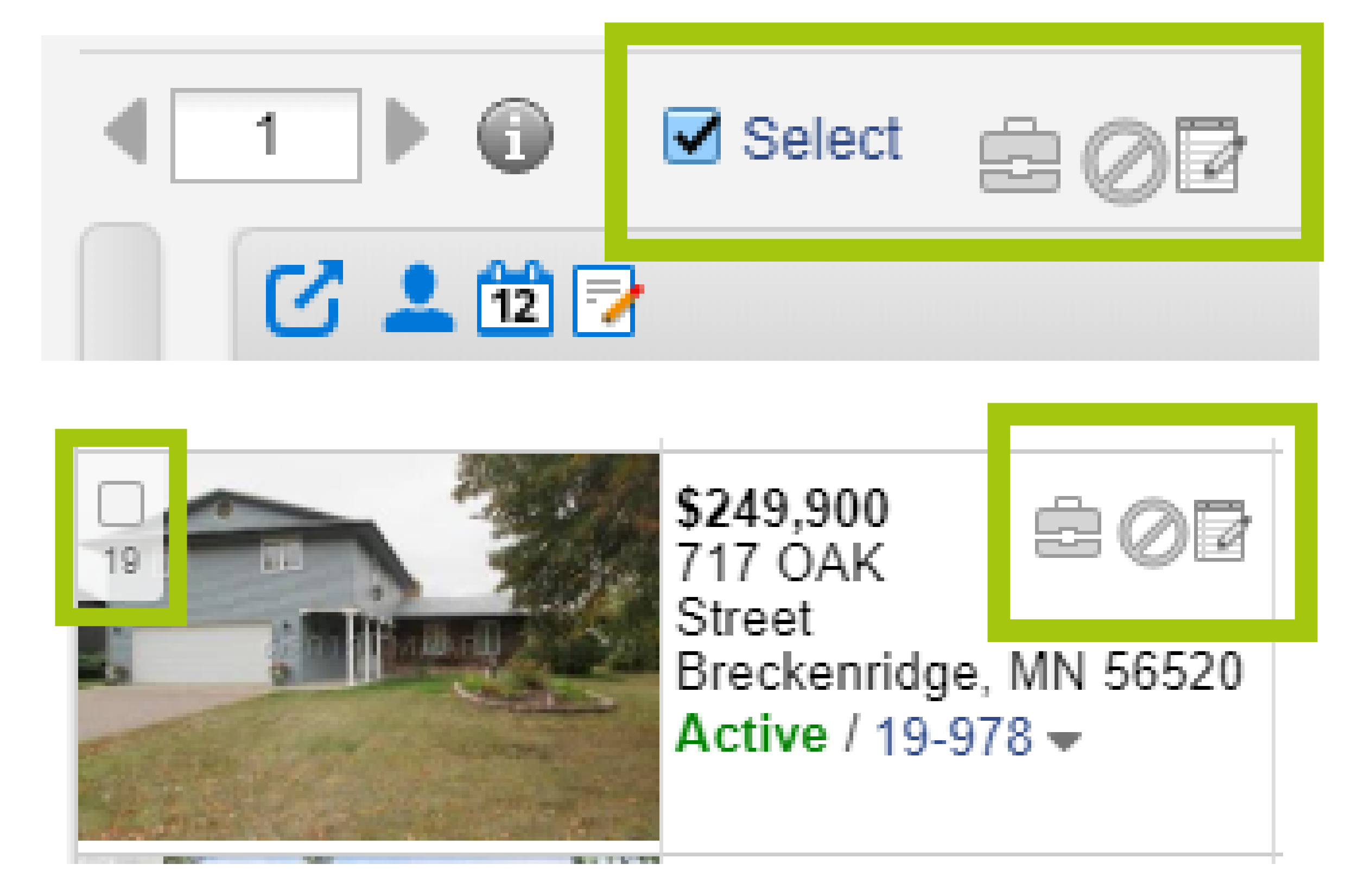
When the left pane of the search results page is collapsed, the Select, Recommend, Hide, and Notes options also will be removed from the space above the search results. To access these options for a listing, expand the left pane.
Why Are We Making These Changes
We heard your primary feedback about the new Quick Search appearance, which was that there was less workspace on the screen. This update makes more effective use of vertical browser space. FBS recommends using a browser size of 950 x 550 or greater when using Flexmls Web. We’ve optimized the user interface based on this minimum requirement, which our research shows covers more than 95% of Flexmls Web users.
