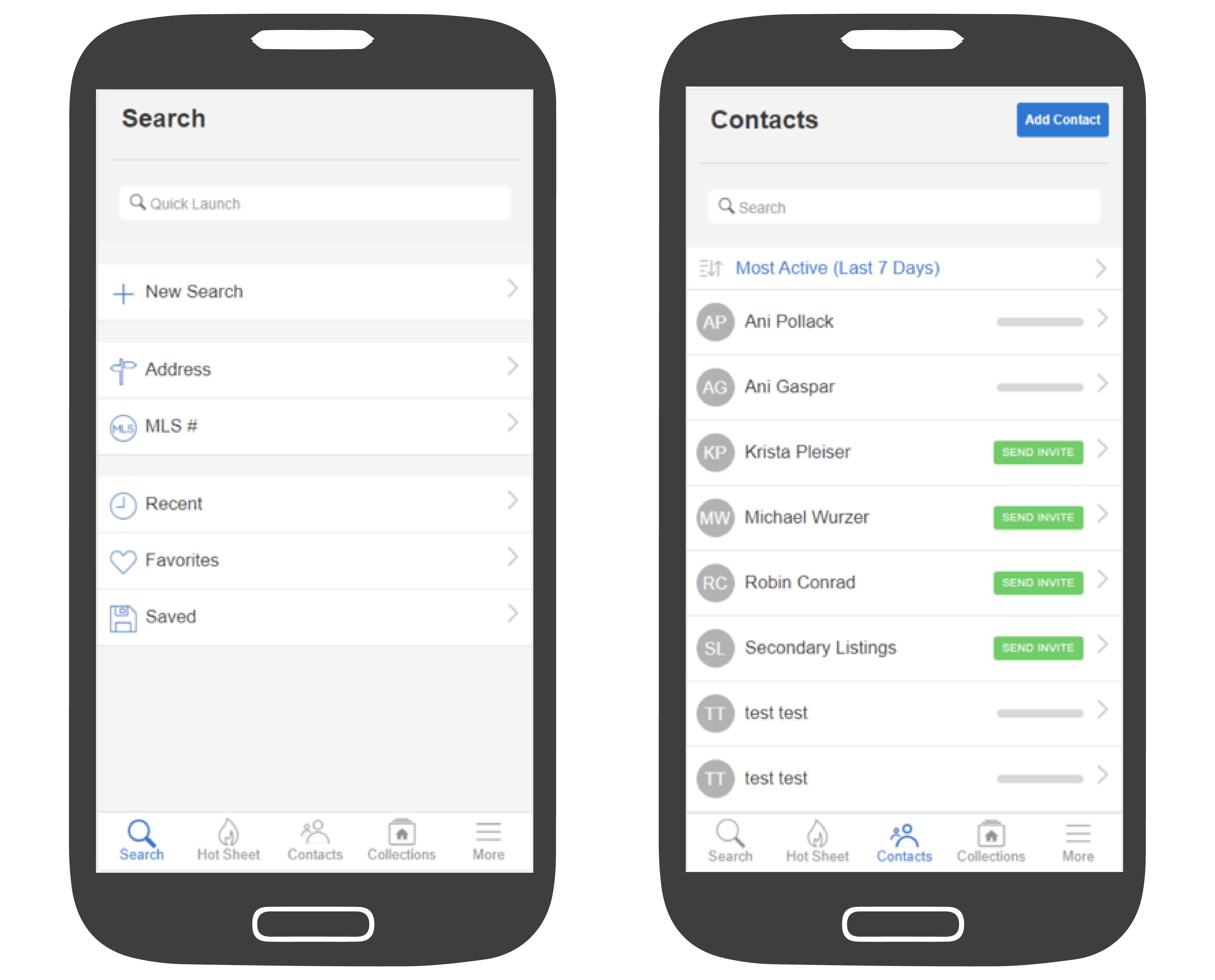
Starting on July 19th you’ll notice that the headers in Flexmls Pro for Android and Flexmls Pro Mobile Web are more prominent and easier to read. This will help make the title of page easier to see, make the design more user-friendly, and make navigation between pages more intuitive. These styling changes will also be reflected when your contacts view listings from a web browser on their mobile devices.
When Will It Change
This update will be available on July 19, 2018.
Who Will Be Affected
All users who use Flexmls Pro for Android and Flexmls Pro Mobile Web will receive these updates. Additionally, consumers looking at listings on mobile web browsers will see similar styling changes.
What Will Change
Page Headings
The page headings will be bigger, bolder, and left-aligned. Examples for the Search page and Contacts page are shown below.

Improved Navigation
When you see a Back option at the top of the screen, the label will indicate which page the button will take you back to–making navigation between pages more intuitive.

In the example above, you can see how the user was on the Hot Sheet screen and tapped to view listings with a Price Change. If they want to return to the Hot Sheet, they can tap the return to Hot Sheet link at the top of the page.
Why Are We Making This Change
This update is part of our ongoing commitment to making Flexmls Pro intuitive and easy to use.
