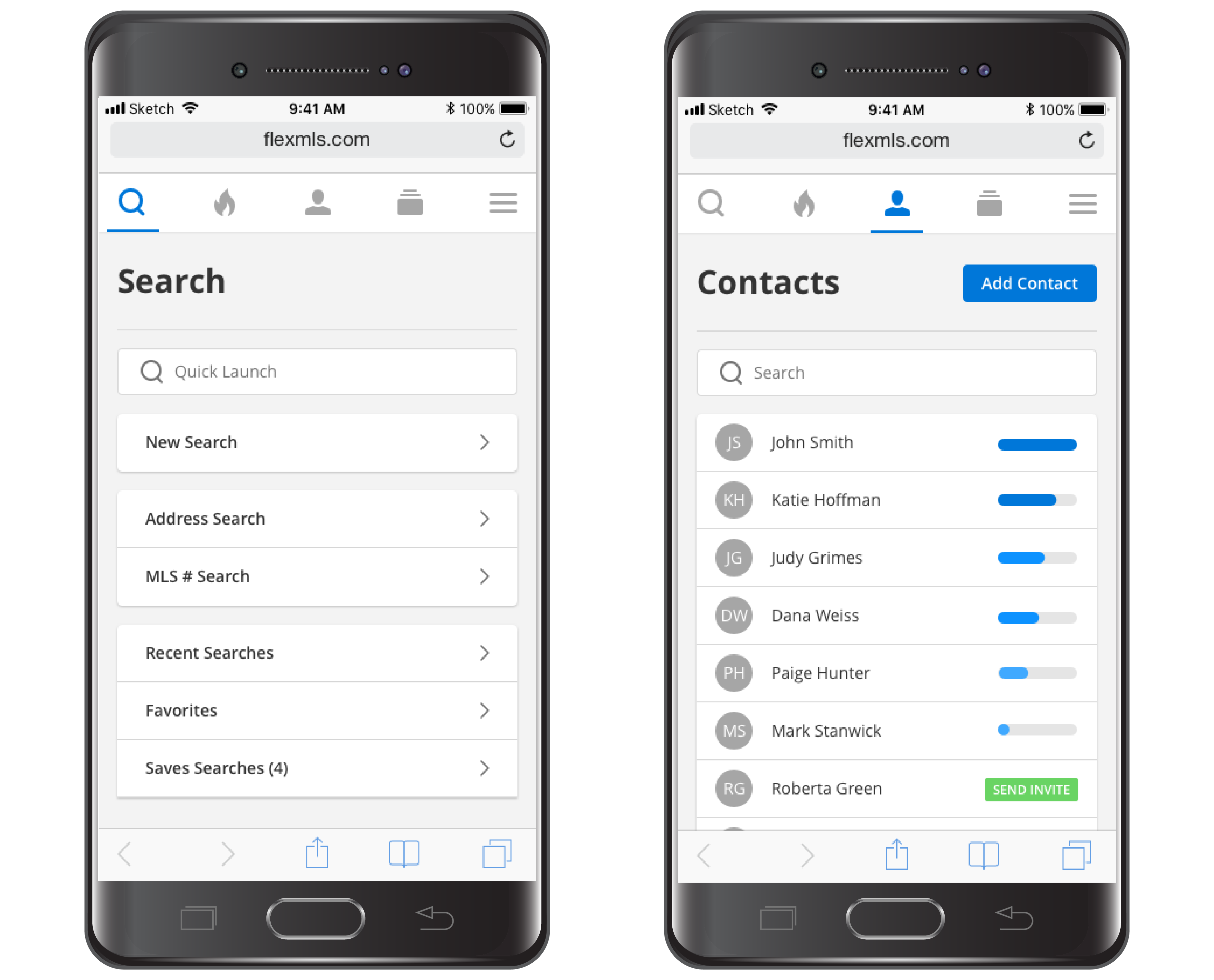
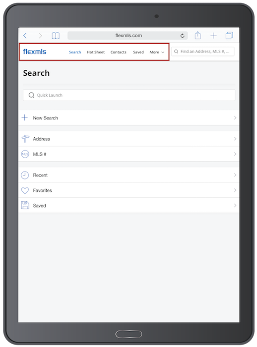
Starting on July 26th users of Flexmls Pro for Android and Mobile Web will notice an updated design that places the Menu at the top of the screen. These versions of the apps are now tailored to the screen size, so if the screen is large (like on a tablet), the menu icons will display as easy-to-read text. These updates reflect the common Android styling of keeping menus at the top of the screen and make the workflows more intuitive and user friendly. Clients will see a similar design when viewing listings on mobile websites – the menu will display at the top of the screen.
When Will It Change
This update will be available on July 26, 2018.
Who Will Be Affected
All users who use Flexmls Pro for Android and Flexmls Pro Mobile Web will receive these updates. Additionally, consumers looking at listings on mobile web browsers will see similar styling changes.
What Will Change
Menu at the Top
The menu bar will display at the top of the screen. Examples for the Search page and Contacts page are shown below.

Menu – Tailored to Page Size
When using Flexmls Pro for Android or Mobile Web on a larger device, such as a tablet, the Menu icons will display as text rather than icons. The menu bar will display at the top of the screen and tapping the Flexmls logo allows you to return to the default search screen. An example of the Search screen appears below.

Why Are We Making These Changes
These updates are part of our ongoing commitment to making Flexmls Pro intuitive and easy to use. Moving the menu to the top of the screen reflects the standard menu placement for Android apps. Additionally, it keeps the menu accessible and at the top of the screen on all mobile web platforms. Finally, it mirrors the menu placement of the full Flexmls Web experience, keeping the user experience similar between platforms.
